Analytics Studio — Tutorial
Step 2 of 3 — Create and configure a widget
In this step, thewidget which will obtain the data from the dataset that was created in the previous step. The data obtained will be shown in graphical form by the widget.
Still on the senior X Platform, access the menuTechnology > Customization > Analytics Studio > New analytics widget to access the new widget configuration screen. On this screen, make the following settings:
1. Widget information and dataset selection:
- Name — fill in a name that easily identifies the widget.
- Tags — create markers (tags) for the widget. This will help you search for the widget when filtering by the tag name in the search field.
- Standard size — define the dimensions of the widget, which will determine the space it will occupy on the page.
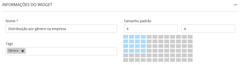
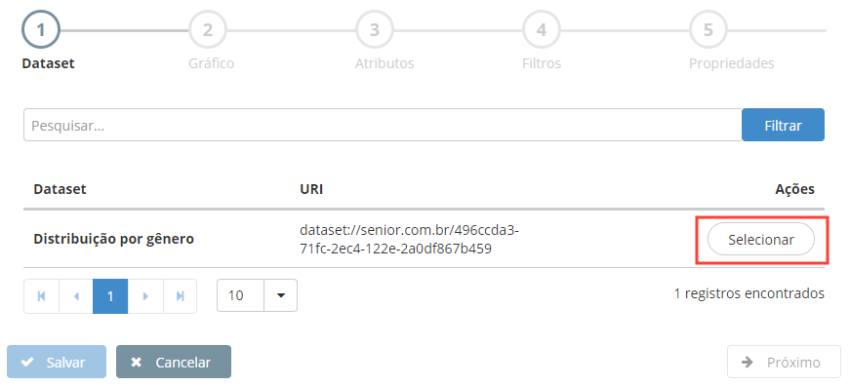
Below the widget's initial information, select the dataset that will be used to create the widget's graph.
For this example, select the datasetDistribution by gender which was created in the first part of the tutorial:
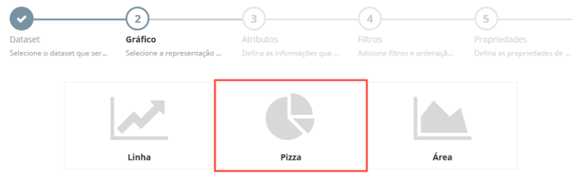
2. Chart:
The next step is to choose the type of chart you want to show in the widget. In this example, the graph of the typePizza:
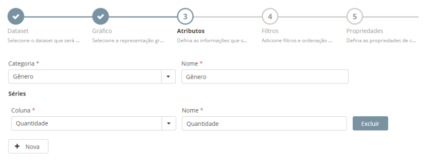
3. Attributes:
Attributes determine criteria for displaying each information in a given category.
For this example, the option was selectedGender atCategory and added aSeries with the attributeAmount.
This setting will cause the graph to display theamount of recordsfor each genre:
4. Filters:
In this step you can applyfilters It isordering to the dataset. With this, a single dataset can be used to create several widgets.
Filter and sort will not be added for this example tutorial.
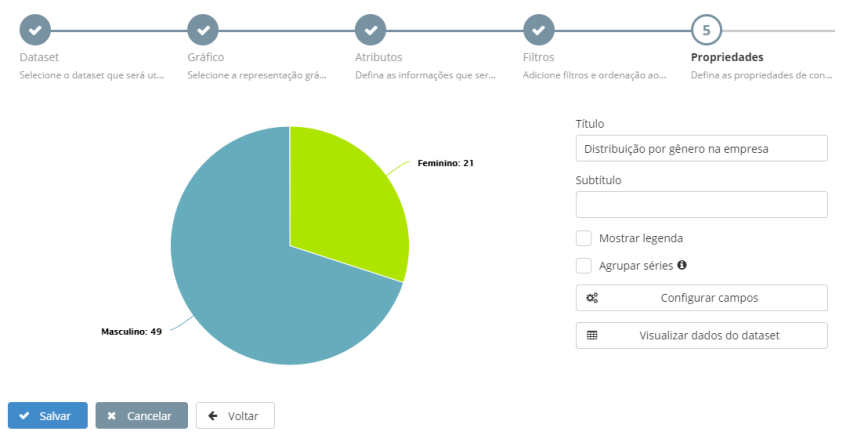
5. Properties:
- Title It isCaption — define a title and subtitle to display in the widget;
- Show caption — select this option if you want the chart captions to be displayed in the widget;
- Group series — select this option if you want series values to be grouped. When this option is selected, it will be necessary to inform the type of grouping desired (sum, average, minimum or maximum);
- Configure fields - To configure fields, click to specify the precision, prefix, suffix, and use of decimal formatting for the displayed series data. Decimal formatting is enabled by default for number series; to disable it, uncheck the corresponding check box.
click inTo save to save widget changes.


